On this page:
About the report
Use this report to learn how well your students are meeting your usage and achievement goals for Reading Assistant Plus by checking student performance at the selection level; that is, how well the students performed in the reading selections as a whole. Students who consistently use the Reading Assistant Plus software and progress through content while maintaining a high level of performance typically gain the most benefit from the component.
For a detailed breakdown of student performance at the task/skill level, see the student level reports for Reading Assistant Plus.
This report shows results for students who used the component within the selected date range. See the Group Usage and Performance Averages chart for the number of students included.
Except where noted, the results in this report reflect completed selections only, and only the first completion of a selection (results from any repeats are excluded). To learn more see Completing selections.
Throughout the report, mySciLEARN uses specific benchmarks and guidelines to indicate student achievement. To learn more see About Reading Assistant Plus report scores.
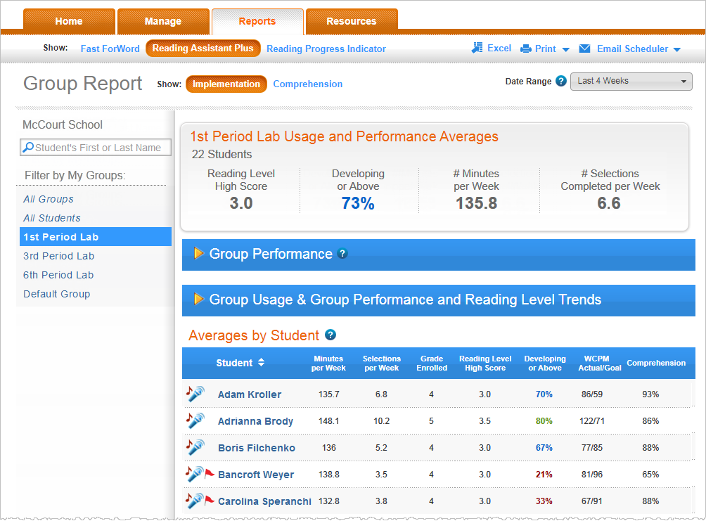
Group Usage and Performance Averages chart
This chart provides a summary of how well your students are meeting usage and performance expectations. The selection performance metrics—Reading Level High Score and Developing or Above—measure actual achievement. The component usage information—minutes per week and selections per week—allows you to quickly measure implementation for the group.
Students. The number of students who used the component within the selected date range. These are the students included in the report.
Reading Level High Score. The average Reading Level High Score for the students. Students who have not mastered any selections are not included in this calculation. If none of the students have earned a Reading Level High Score, this field shows N/A. To learn more see Reading Level High Score.
Developing or Above. The percentage of selections completed at a performance level of developing or proficient. mySciLEARN uses colors to rate this percentage as excellent (green), good (blue), or needs improvement (red). To learn more see Developing or Above. Note that the software calculates this percentage using the performance levels from all completed selections, rather than averaging the Developing or Above scores that appear in the Averages by Student table (at the bottom of this report).
Minutes per Week. The average number of minutes per week the students spent using the component, including time spent repeating selections and selections that are still in progress. Students who spend the expected amount of time using the software each week—as prescribed by either the component schedule or by your own classroom schedule—are more likely to improve their performance and achieve success.
Selections Completed per Week. The average number of selections per week completed by the students. Students who consistently complete content each week have a greater chance of improving their performance and achieving success. To learn more see Completing selections.
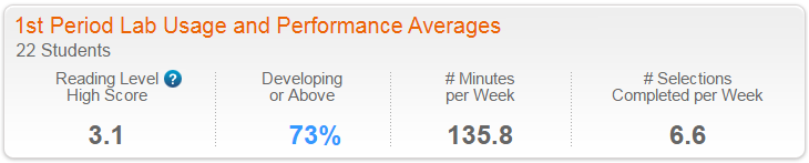
Group Performance graph
When viewing a single group, this scatter plot graph provides an at-a-glance view of how well your students are performing in the component. Click the arrow next to the section title to expand the section and view the graph.
Note that because this graph presents results on the student level instead of the group level, it only appears when viewing a single group.
X-axis. Maps the student's average reading level—that is, the average reading level of the selections completed by the student.
Y-axis. Maps the student's performance—that is, the percentage of selections completed at a performance level of Developing or Above. To learn more see Developing or Above.
Each student who has completed at least one selection in the date range appears on the graph, represented by a small bubble. Students at the same average reading level and within five Developing or Above percentage points of each other are grouped together in the same bubble, which becomes larger as it includes more students. These groupings can help you quickly identify students at similar reading and performance levels. Each bubble is color coded to indicate the Developing or Above percentage for that corresponding reading level. Hold your cursor over a bubble to see the students represented by that bubble, along with the actual Developing or Above percentage.
- Excellent (green). 80% to 100%
- Good (blue). 60% to 79%
- Needs Improvement (red). Lower than 60%
Group Usage & Group Performance and Reading Level Trend graphs
When viewing a single group, this section of the report includes two graphs that illustrate group implementation and achievement trends. Click the arrow next to the section title to expand the section and view the graphs.
Note that when viewing all groups, the two graphs appear independently in the report instead of within the Group Usage & Group Performance and Reading Level Trends section.
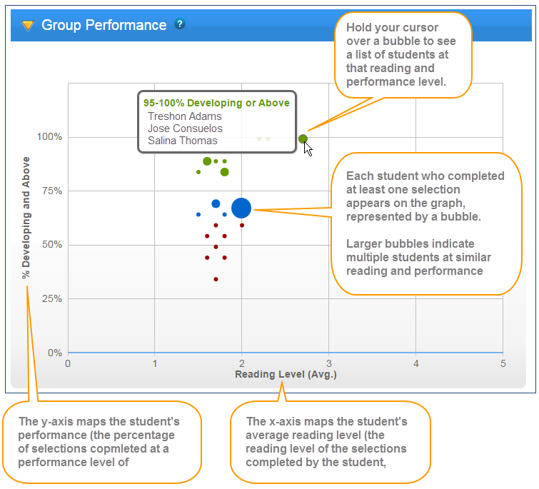
Group Usage Trend graph
This graph illustrates how well your students are meeting your implementation goals for each week in the date range. Reviewing these results over multiple weeks can help you identify component usage trends and—if needed—take corrective action, such as monitoring student usage in the classroom or providing incentives to increase productivity.
X-axis. Maps the weeks in the date range that the students used the component. If none of the students trained during a week, that week does not appear in the graph.
Y-axis. Maps two related usage trends for the students:
![]() Minutes (Avg.). The orange bars show the average number of minutes per week spent working on the component, including time spent repeating selections, and selections that are still in progress. One bar appears for each week. The reference scale appears on the left side of the graph, in orange.
Minutes (Avg.). The orange bars show the average number of minutes per week spent working on the component, including time spent repeating selections, and selections that are still in progress. One bar appears for each week. The reference scale appears on the left side of the graph, in orange.
![]() Completed Selections (Avg.). The blue dots show the average number of selections completed each week, connected by a blue line across the weeks in the graph. The reference scale appears on the right side of the graph, in blue. To learn more see Completing selections.
Completed Selections (Avg.). The blue dots show the average number of selections completed each week, connected by a blue line across the weeks in the graph. The reference scale appears on the right side of the graph, in blue. To learn more see Completing selections.
By default, this graph shows all results. You choose which data to include in the graph by clicking that item in the legend at the top of the graph. Hold your cursor over an item in the graph to view the actual minutes or selections, broken down by completed selections and repeated selections.
Group Performance and Reading Level Trend graph
Use this graph to view a group's selection performance for each week in the date range. Reviewing these results over time can help illustrate student progression trends and reading proficiency gains.
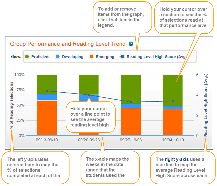
X-axis. Maps the weeks in the date range that the students used the component. If none of the students trained during a week, that week does not appear in the graph.
Y-axis. Maps two related performance trends for the students:
- % of Reading Selections. The stacked orange, blue, and green bars show the average percentage of selections completed at each performance level; that is, the percentage of selections completed at each of the levels. For more information on interpreting these levels see Performance Levels. The reference scale appears on the left side of the graph.
-
 Reading Level High Score (Avg.). The blue dots show the average number of selections completed each week, connected by a blue line across the weeks in the graph. The reference scale appears on the right side of the graph, in blue. Ideally, for groups that follow a regular usage schedule and have fewer membership changes (students are not added to or removed from the group), this graph should go up over time as students read increasingly difficult content and improve their scores. If none of the students completed any selections during a week, the graph will not show a Reading Level High Score for that week. To learn more see Reading Level High Score.
![]() Proficient
Proficient
![]() Developing
Developing
![]() Emerging
Emerging
By default, this graph shows all results. You choose which data to include in the graph by clicking that item in the legend at the top of the graph. To view the actual results in the graph, hold your cursor over that item in the graph. For example, if you hold your cursor over a section of a bar graph, you'll see the percentage of selections completed at that level that week and the number of selections completed at that level over the total selections completed at all levels that week. If any selections were repeated at any level that week, you'll also see how many selections out of the total completed selections that week were repeated.
Averages by Group table (all groups)
When viewing all groups, this table provides implementation details for the groups that used the component within the selected date range. It lets you easily compare results across groups.
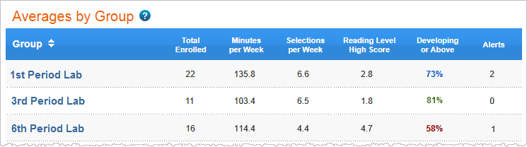
The table includes the following columns. Click a column header to sort the report.
Group. The groups who used the component within the selected date range. Click a group name to access the implementation success report for that group.
Total Enrolled. The number of students in the group who used the component within the selected date range.
Minutes per Week. The average number of minutes per week the students used the component, including time spent repeating selections, and selections that are still in progress. Students who spend the expected amount of time using the software each week—as prescribed by either the component schedules or by your own schedule—are more likely to improve their performance and achieve success.
Selections per Week. The average number of selections per week completed by the students. Students who consistently complete content each week have a greater chance of improving their performance and achieving success. To learn more see Completing selections.
Reading Level High Score. The average Reading Level High Score for the students. Students who have not mastered any selections in the date range are not included in this calculation. If none of the students have earned a Reading Level High Score, this field shows N/A. To learn more see Reading Level High Score.
Developing or Above - The percentage of selections completed at a performance level of developing or proficient. This score is rated as excellent (green), good (blue), or needs improvement (red). To learn more see Developing or Above. If none of the students have completed a selection, this field shows N/A.
Alerts. The total number of intervention alerts for the students. An intervention alert indicates that a student requires immediate attention. If there are no interventions, this field is blank. Use the Averages by Student table table in this report to see which students have alerts and how to view them. To learn more see About report status updates and alerts.
Averages by Student table
When viewing a single group, this table provides implementation details for the students in the group who used the component within the selected date range. It lets you easily compare results across students.
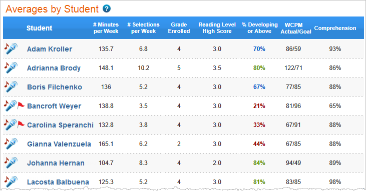
The table includes the following columns. Click a column header to sort the report.
![]()
Student. The first and last names of all students in the group who used the component within the selected date range. Click a student's name to access the Implementation Success report for that student. This column shows any current alerts for a student. Click the alert icon ![]() to go to the student's Implementation Success report and then click the alert icon there for detailed recommendations. To learn more see About report status updates and alerts. When exporting the report, this table also includes student IDs for each student in the report.
to go to the student's Implementation Success report and then click the alert icon there for detailed recommendations. To learn more see About report status updates and alerts. When exporting the report, this table also includes student IDs for each student in the report.
Minutes per Week. The average number of minutes per week the student spent working on the component, including selections that are in progress. Students who spend the expected amount of time using the software each week—as prescribed by either the component schedule or by your own schedule—are more likely to improve their performance and achieve success.
Selections per Week. The average number of selections per week completed by the student. Students who consistently complete content each week have a greater chance of improving their performance and achieving success. To learn more see Completing selections.
Grade Enrolled. The student's grade when he or she started working on the component.
Reading Level High Score. The highest reading level mastered by the student. If the student has not mastered a selection in the date range, this field shows N/A. To learn more see Reading Level High Score.
Developing or Above - The percentage of selections completed at a performance level of developing or proficient. This percentage is rated as excellent (green), good (blue), or needs improvement (red). To learn more see Developing or Above. If the student has not completed a selection in the date range, this field shows N/A.
WCPM (Actual/Goal). The student's performance in the Read and Record activity, which indicates the student's fluency skills. It shows an average of the highest words correct per minute (WCPM) scores from each of the completed selections over an average of the WCPM goals from each of the completed selections. The highest WCPM score could be from an additional reading of the selection. See the student's Selection report for details on the fluency goal for a selection. If the student has not completed a selection in the date range, this field shows N/A.
Comprehension. The student's performance in the Take the Quiz activity, which indicates the student's comprehension skills. It shows an average of the percent correct high scores from each of the completed selections. The percent correct high score could be from an additional retake of a quiz. The score is based on a scale of 0% to 100%. A score of 80% or higher indicates that the student has a good understanding of the skills worked on in the selections, while a score below 80% indicates that the student needs to work on these comprehension skills. See the student's Selection report for details on how the student's comprehension skills are measured within a selection. If the student has not completed a selection in the date range, this field shows N/A.
Tip: Because the WCPM and Comprehension scores measure individual skills rather than overall selection performance, their calculations may also include partially repeated selections. For example, if the student retakes the quiz in a selection but does not read the selection again, the results from that quiz will still be considered when calculating the Comprehension score.